
 0 Comments
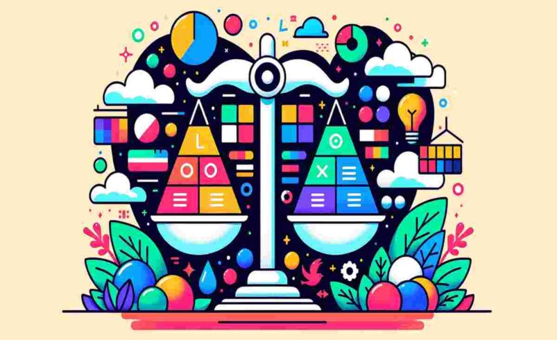
Balancing Looks and Usability in Design
When you open an app or visit a website, you decide if you like it in just a split second! That’s because our brains process designs super fast. Apps like TikTok are popular because they look good and are easy to use. This mix of looking nice (form) and working well (function) is what makes a great user experience, or UX. Let’s learn how designers make things both pretty and practical for everyone, in a way that’s easy for you to understand.
What Are Form and Function?
Form is how something looks. Think of the colors, fonts, pictures, and layout of an app or website. These things make you feel happy or excited when you see them. For example, bright colors might make a online game app feel fun.
Function is how something works. It’s about making sure you can use an app or website easily to do what you want, like finding a video or playing a game. If a website looks cool but is hard to use, it’s not very helpful.
Good design mixes form and function so things look great and work smoothly. If an app is only pretty but confusing, you might stop using it. If it’s super easy to use but boring, you might not care about it. Designers need to balance both to make you love using their creations.
How Looks Shape Your Feelings
The way things look can change how you feel about them. Here are some ways designers use visuals to make apps and websites awesome:
- Fonts (Typography): The style of text matters. Big, bold letters might feel exciting, while clean, simple ones feel calm. Fonts also need to be easy to read so you don’t strain your eyes. Different fonts can show a brand’s personality, like being fun or serious.
- Colors: Colors can make you feel things! For example, red might grab your attention or warn you about something, like a “delete” button. Designers pick colors to match the vibe they want, like blue for trust or yellow for energy.
- Pictures and Icons: Cool pictures and simple icons make apps more fun and easier to understand. For example, a play button with a triangle tells you exactly what it does without words.
- Whitespace: This is the empty space around things. It makes a design feel less crowded, so you can focus on what’s important, like a button or text.
Designers use these tricks to make you want to keep using an app or website. They guide your eyes to the right places and make everything feel clear and fun.
Making Things Easy to Use
A design isn’t good if it’s just pretty—it has to work well too! Here’s how designers make sure you can use their creations easily:
- Discoverability: This means you can find what you need without getting lost. For example, a big “search” button is easy to spot.
- Affordance: Things should look like what they do. A button that looks clickable (like it’s raised or glowing) tells you it’s meant to be pressed.
- Feedback: When you tap something, you should know it worked. For example, a button might change color when you click it.
- Forgiveness: If you make a mistake, like deleting something, the app should let you undo it easily.
- Accessibility: Designs should work for everyone, including people with disabilities. For example, text should be big enough for people who don’t see well, and buttons should be easy to tap for those who have trouble with small movements.
To make sure their designs work, designers test them with real people. They watch how people use the app or website and fix anything that’s confusing.
Finding the Perfect Balance
Great design is like a good song—it’s catchy (looks nice) and easy to follow (works well). Here’s how designers make it happen:
- Start with Function: Designers often focus on making things easy to use first, then add cool looks later. If an app is hard to use, no amount of pretty colors will save it.
- Keep It Simple: Simple designs are often the best. Too many colors or buttons can make things confusing and slow down the app.
- Think About Users: Designers talk to people to learn what they need. For example, if kids use an app, it needs big buttons and bright colors. If it’s for adults, it might need a calmer look.
- Test Everything: Designers try their designs with real users to see what works and what doesn’t. This helps them make sure the app is both fun to look at and easy to use.
Ends
When you use an app or website, you want it to look cool and be easy to use. Designers work hard to balance form (how it looks) and function (how it works) to make you happy. By learning about fonts, colors, and usability, they create apps and websites that are fun, clear, and helpful for everyone. Next time you open your favorite app, think about how its design makes it so awesome!