
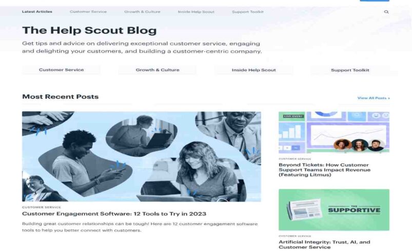
Homepage
Your homepage is more than just a welcome mat. It’s the front door to your reputation—the first place people go when deciding whether or not to do business with you. In B2B and B2C alike, that first impression sets the tone. Done well, it earns trust. Done poorly, it raises doubts.
Why Your Homepage Matters
Your homepage is often the first—and sometimes only—chance to make a good impression. People judge your business’s credibility, professionalism, and trustworthiness based on what they see in those first few seconds. According to Google, users form an opinion in less than 50 milliseconds.
Here’s what that means:
- A cluttered layout, outdated visuals, or broken elements immediately damage trust.
- Clear branding, professional design, and smooth navigation boost confidence.
A homepage that connects visually and emotionally will keep users on your site longer and encourage them to take action.
What Makes a Homepage Effective
There’s no one-size-fits-all, but the best homepages have a few things in common:
Strong Visual Hierarchy
- Your layout should guide the eye—headline first, then the value proposition, and then the next steps.
- Use whitespace to your advantage. It creates breathing room and improves focus.
Clear Messaging
- Tell visitors what you do and who you do it for—fast. Avoid vague or bloated language.
- Include 1–2 strong CTAs to guide next steps (e.g., “Get a Quote,” “See Plans,” “Book a Demo”).
Consistent Branding
- Fonts, colors, tone, and logos should match across your site and other platforms.
- Mixed messages or conflicting design elements can make a brand look unreliable.
Mobile Optimization
- Over half of the traffic is generated by mobile devices. If your homepage doesn’t load quickly and cleanly on phones, you’re losing leads.
- Prioritize fast loading, responsive layouts, and touch-friendly navigation.
Avoiding Common Homepage Mistakes
A homepage should simplify—not complicate—the user journey. But many brands make preventable errors:
- Overloading the screen. Too much text or too many CTAs create paralysis, not action.
- Neglecting page speed. A few seconds of lag and visitors bounce.
- Outdated content. Blog posts from 2019 or broken videos send the wrong message.
- Inconsistent tone. A playful hero banner and a dry corporate footer clash.
The fix? Regularly audit your homepage for content freshness, usability, and brand consistency.
Keeping It Fresh and Professional
Your homepage isn’t a set-it-and-forget-it asset. It requires regular maintenance and updates to reflect your evolving business needs.
Build a routine:
- Update hero images, taglines, or CTAs quarterly.
- Replace outdated testimonials or team bios.
- Check for broken links or technical errors on a monthly basis.
Think of your homepage like your storefront window. People are always walking by—and they notice when it’s dusty, empty, or off-brand.
How to Measure Homepage Success
Want to know if your homepage is working? Start with these three metrics:
- Bounce Rate: Are users leaving after just one page? If yes, something’s off.
- Conversion Rate: How many visitors are clicking your CTAs or filling out forms?
- Engagement Time: How long are people staying on your homepage before exploring?
Combine those data points with heatmaps and user recordings (tools like Hotjar or Microsoft Clarity work well) to see where visitors are dropping off or getting stuck.
Final Takeaway
Your homepage doesn’t need to be flashy, but it does need to be clear, polished, and trustworthy. In an age where digital first impressions are everything, it’s the single most important real estate on your site.
Invest in it like your reputation depends on it—because it does.